Chicago Children’s Theatre
Radiating Creativity: the Vibrant Branding of a Beloved Icon
In the heart of Chicago, I embarked on a mission to infuse the city's beloved Children's Theatre with a burst of creativity and vibrant energy. Extending the brand identity, I crafted a dynamic system for newsletters and banners, radiating confidence and capturing the essence of youthful imagination.
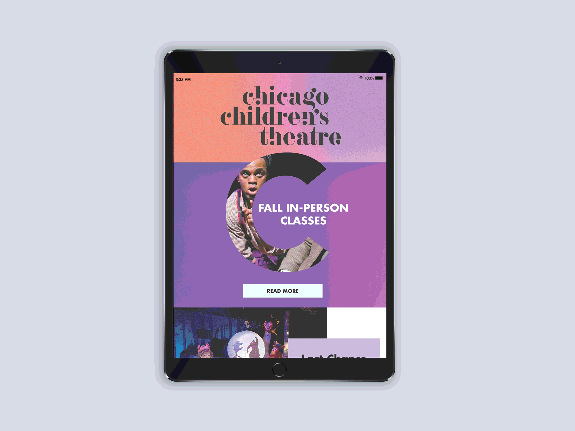
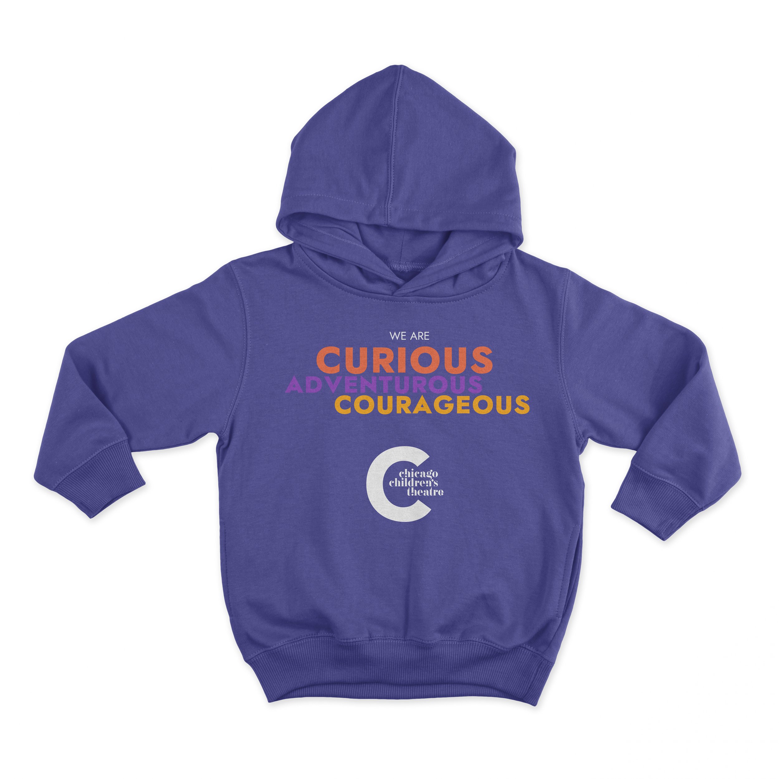
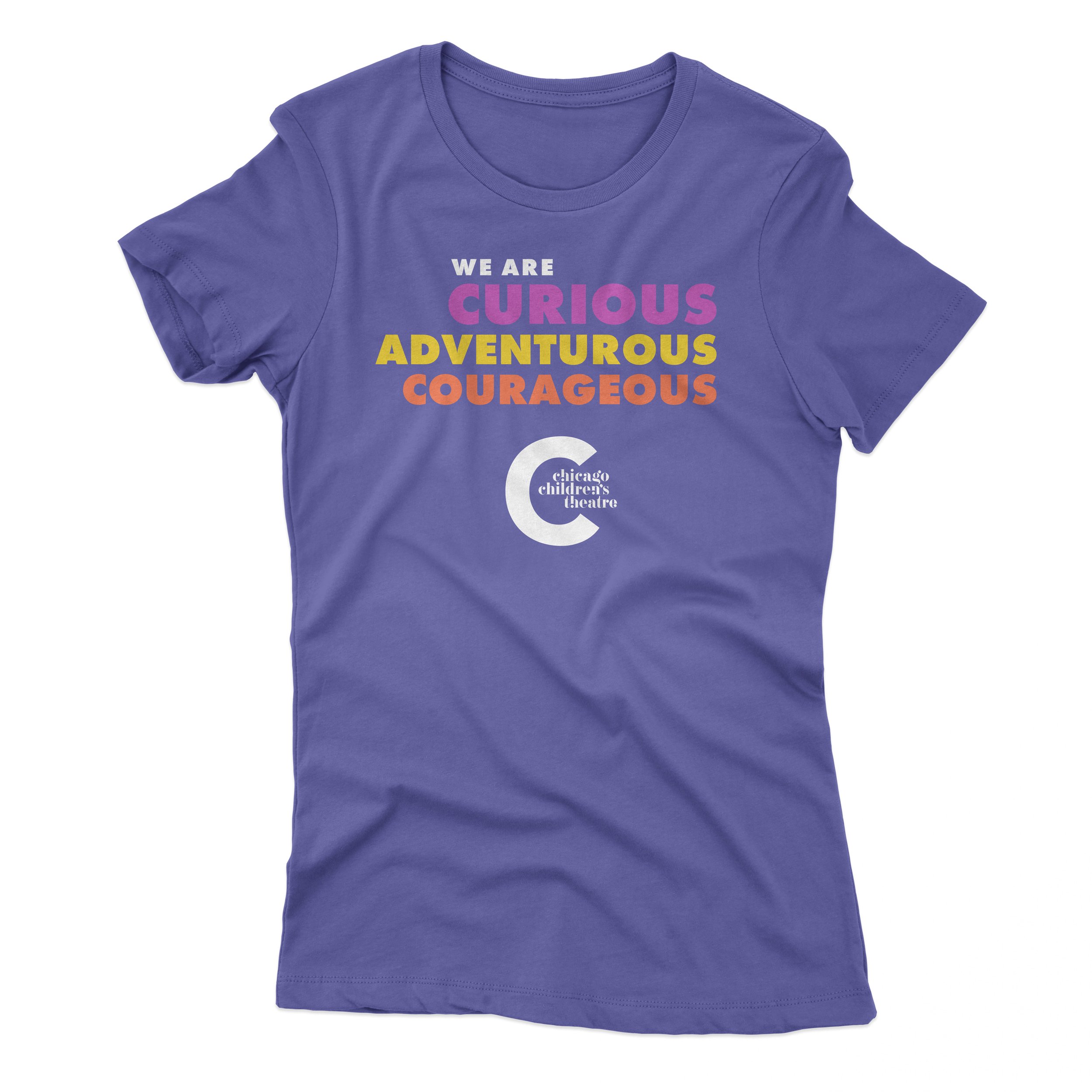
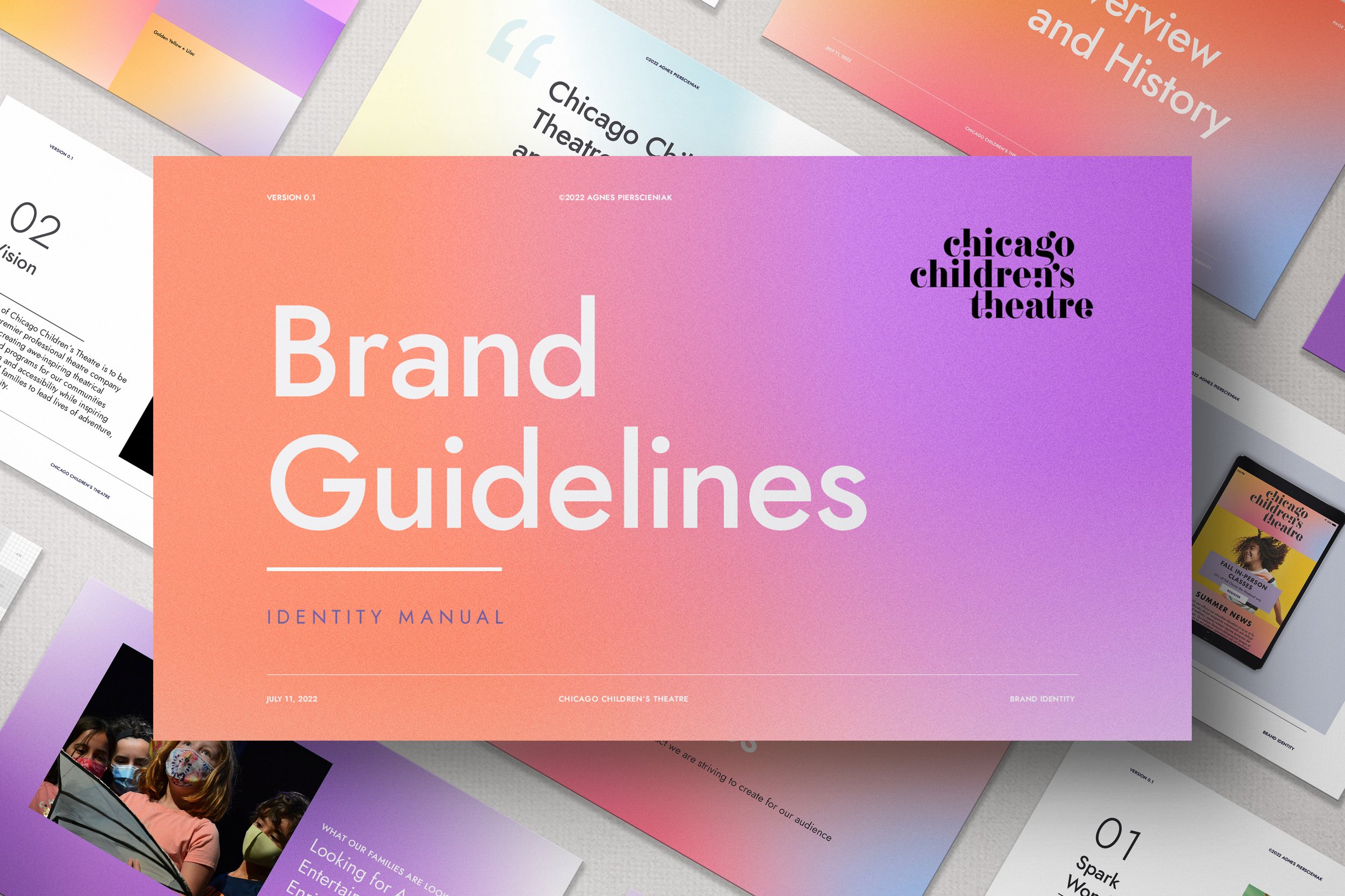
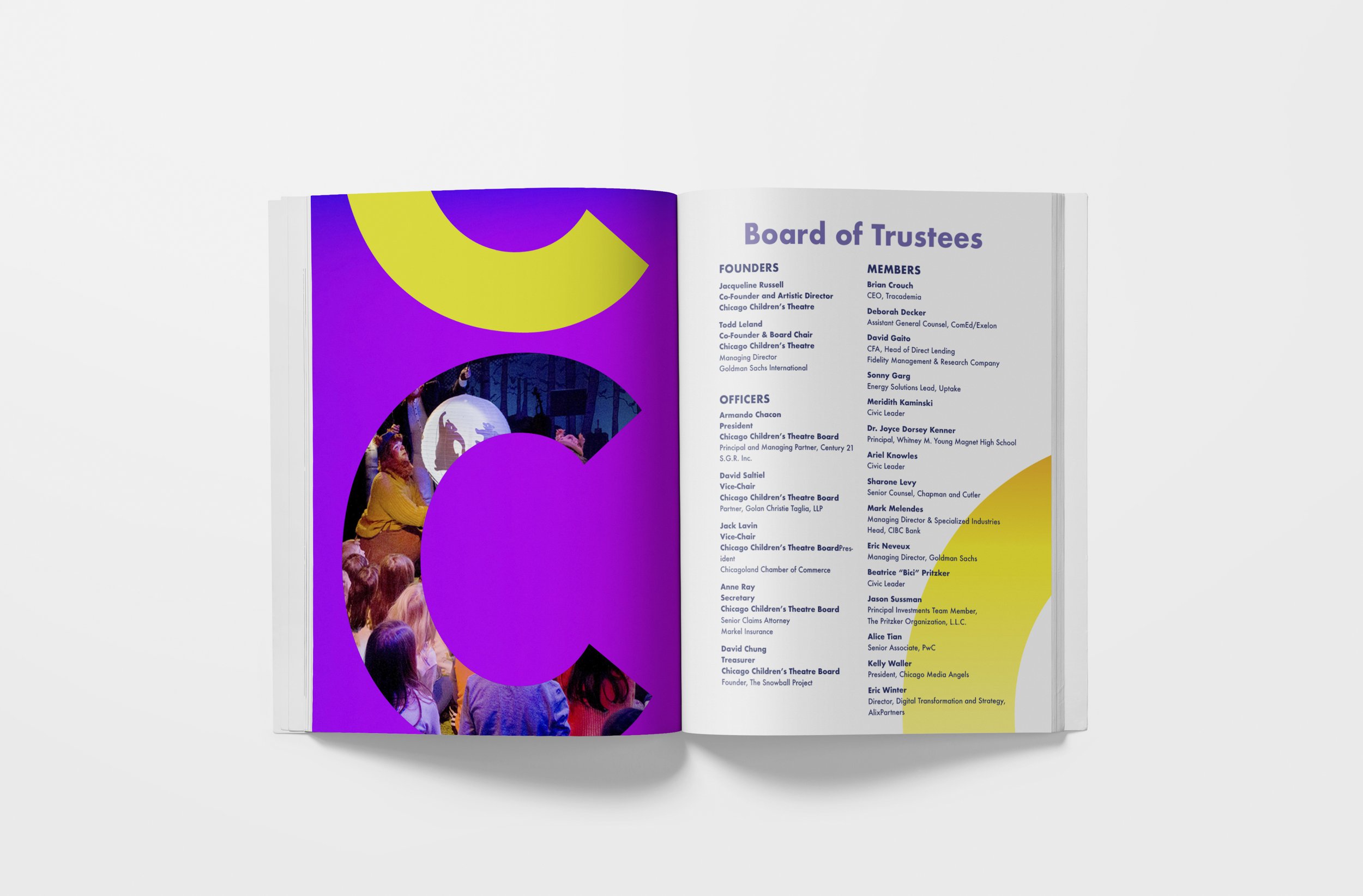
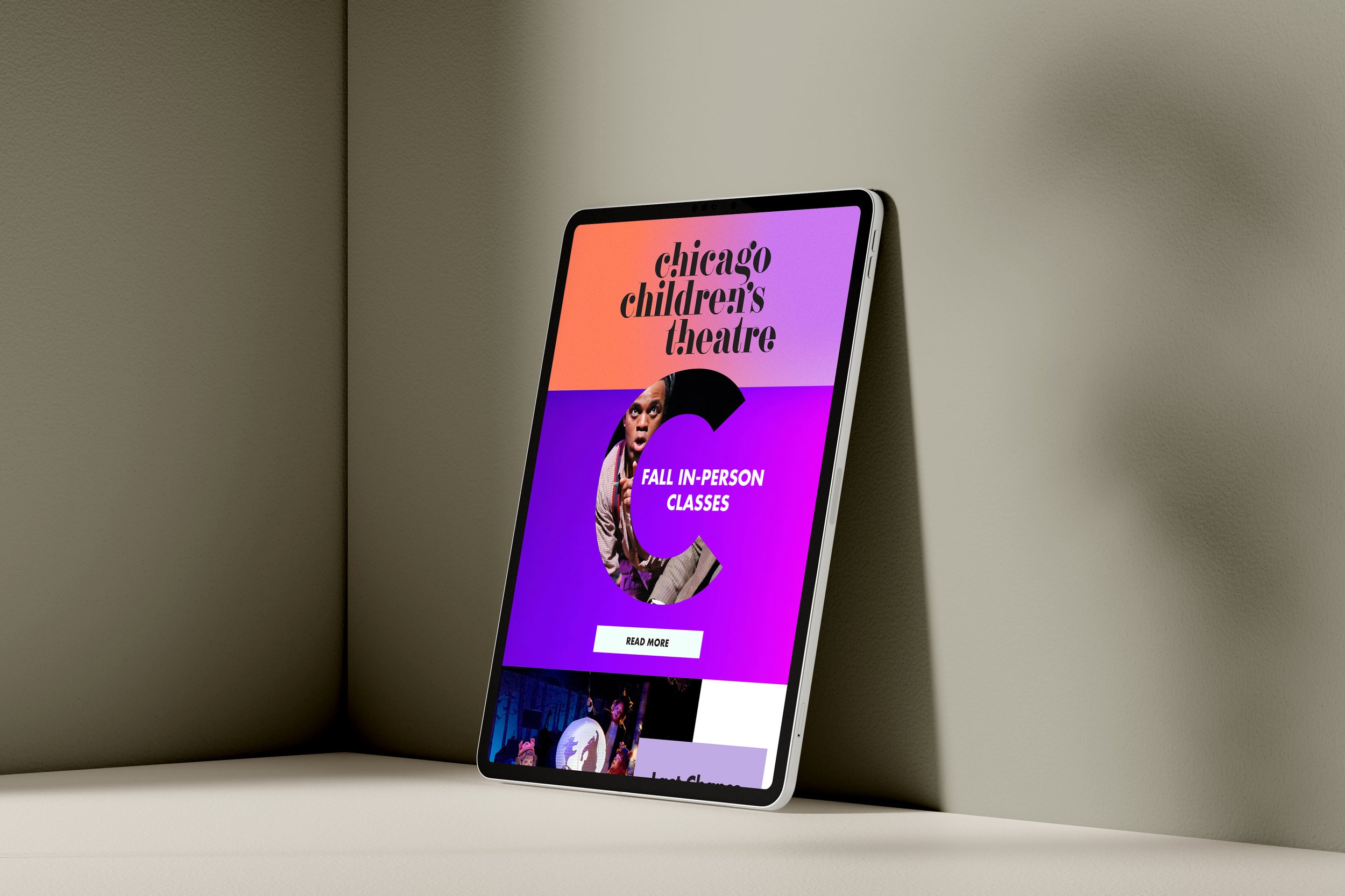
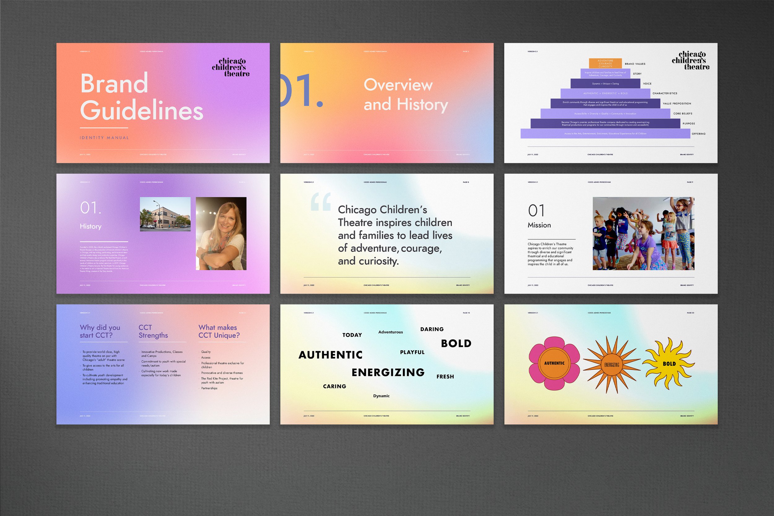
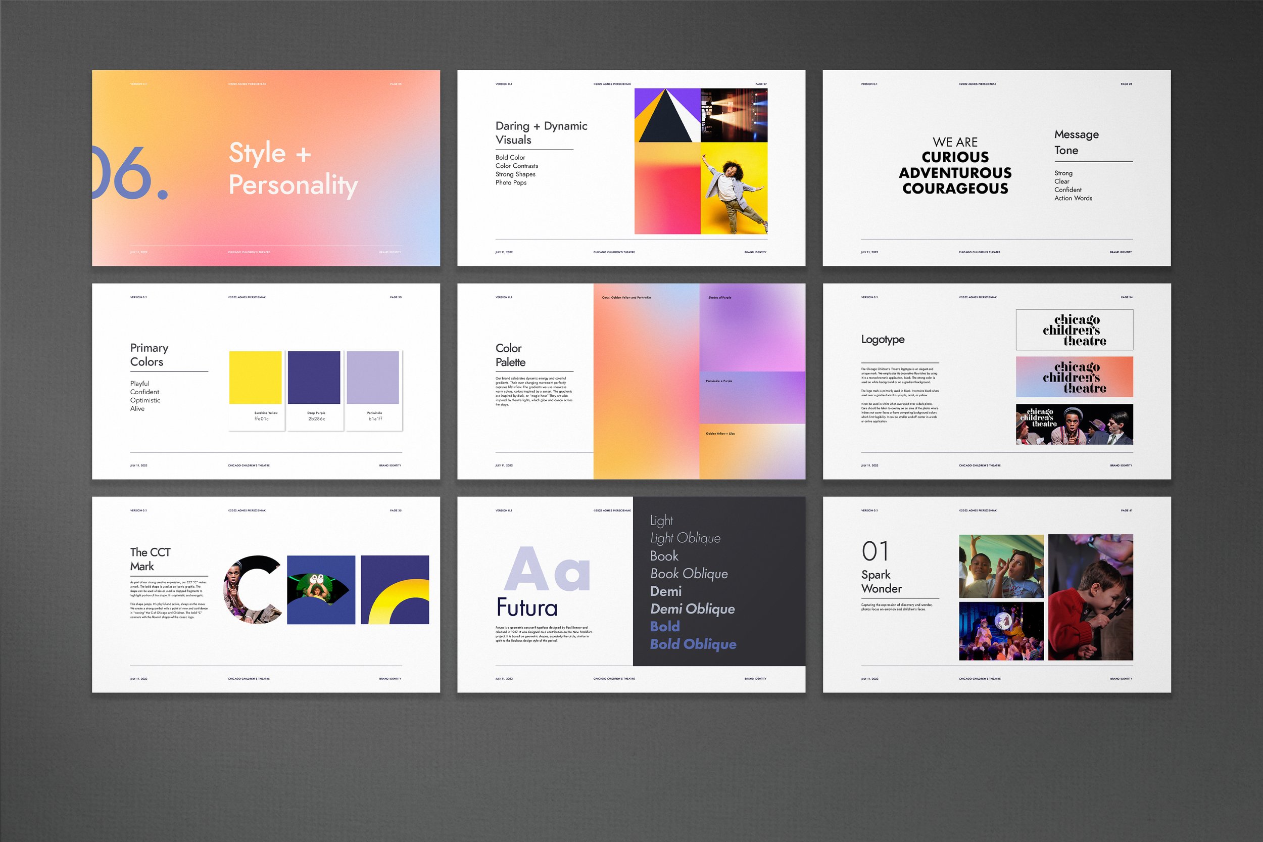
Brand Identity and Guidelines: The core of the branding initiative is a large C logo that serves as the anchor for the entire identity system. Playful typography, bold colors, and whimsical illustrations form a cohesive visual language, expressing the excitement of live performances for all audiences.
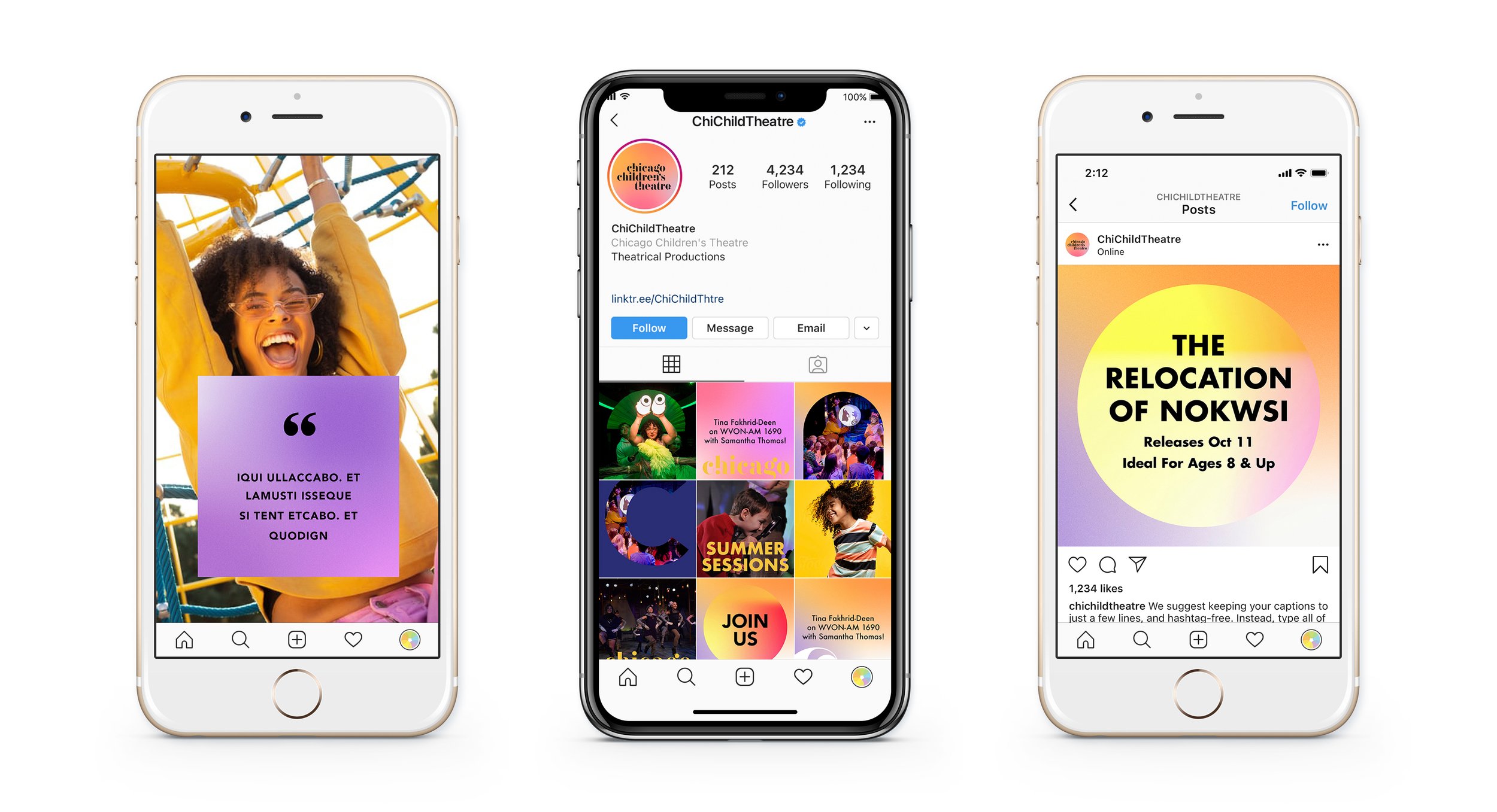
Extension to Newsletters: The brand identity seamlessly integrates with digital marketing, creating an engaging experience for the audience. The newsletters, filled with vibrant hues and playful visuals, mirror the boundless creativity of children. Versatile templates maintain consistency while adapting to different events and themes.
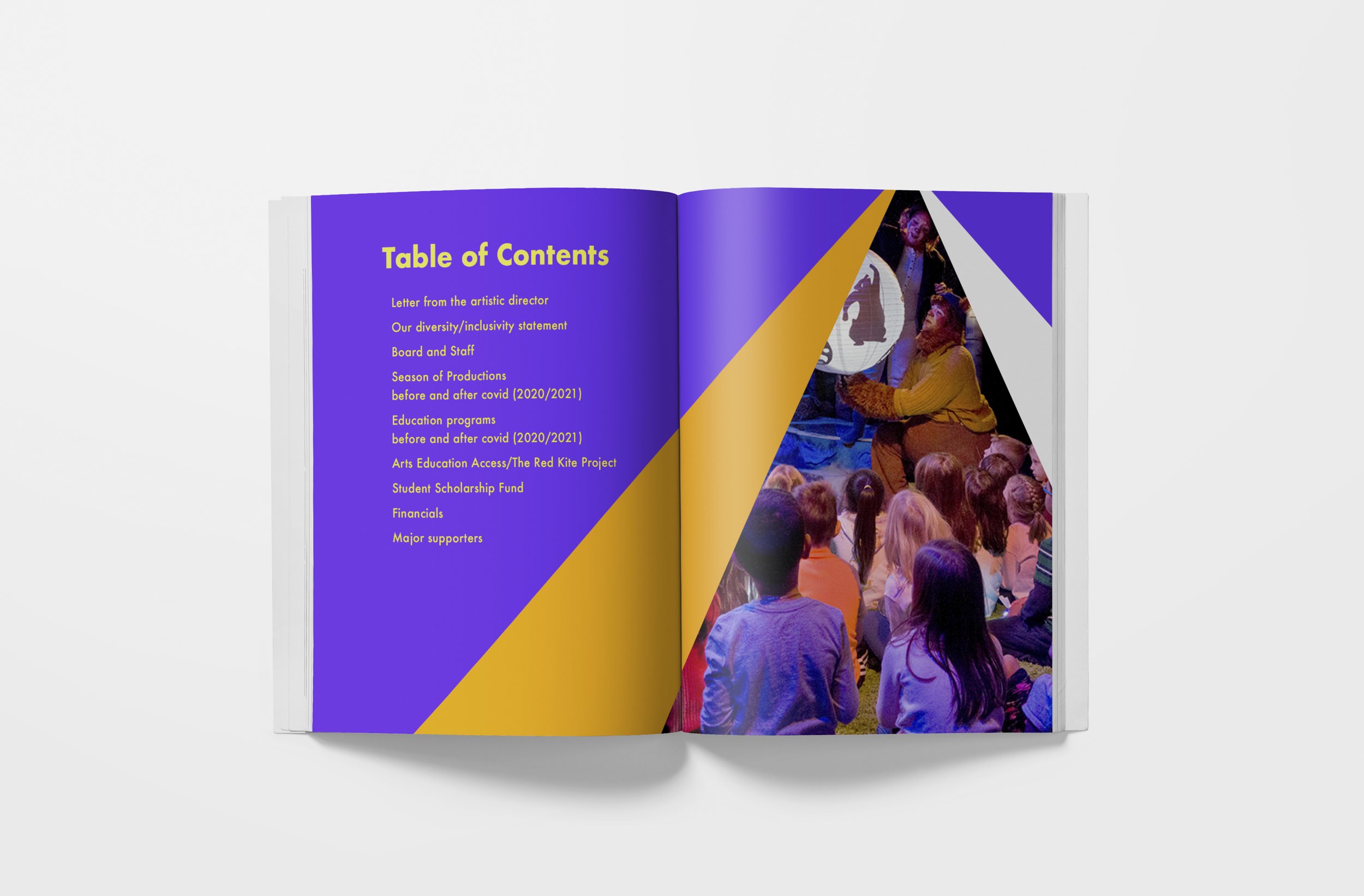
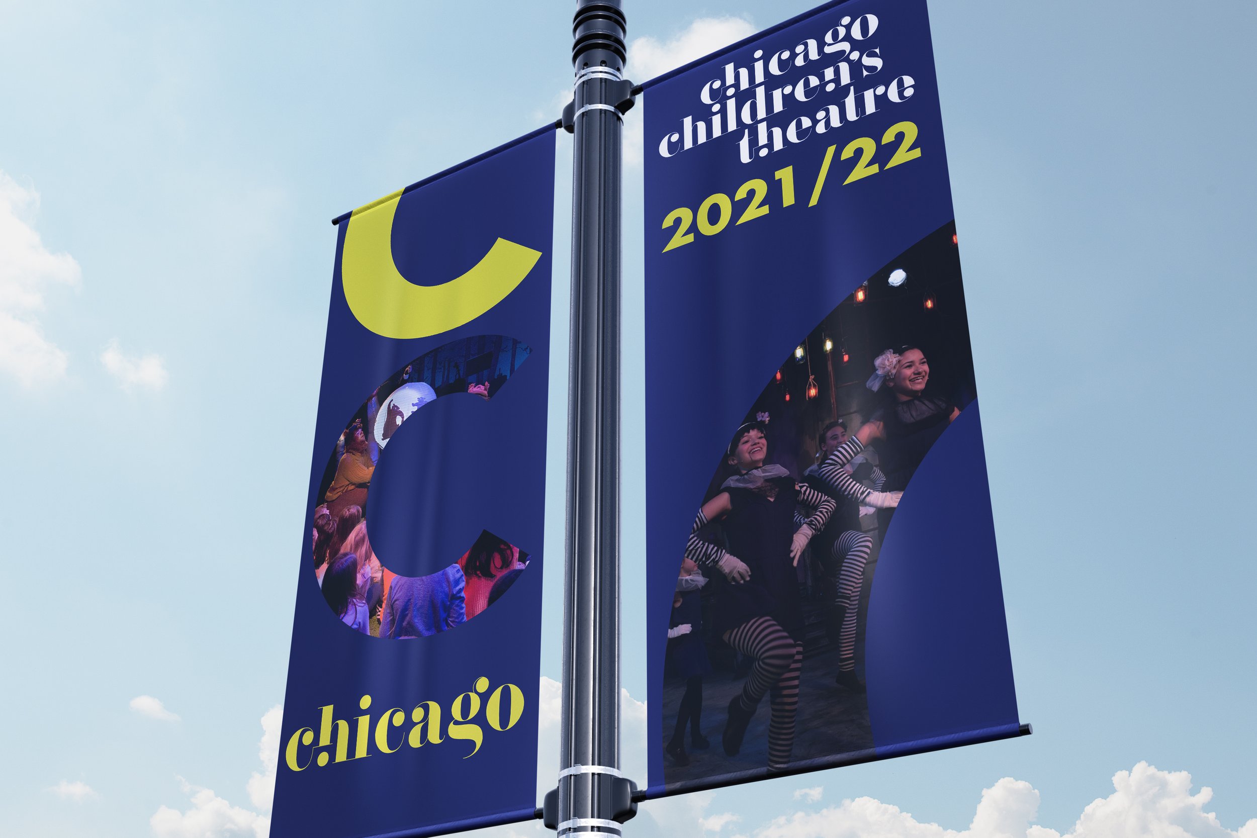
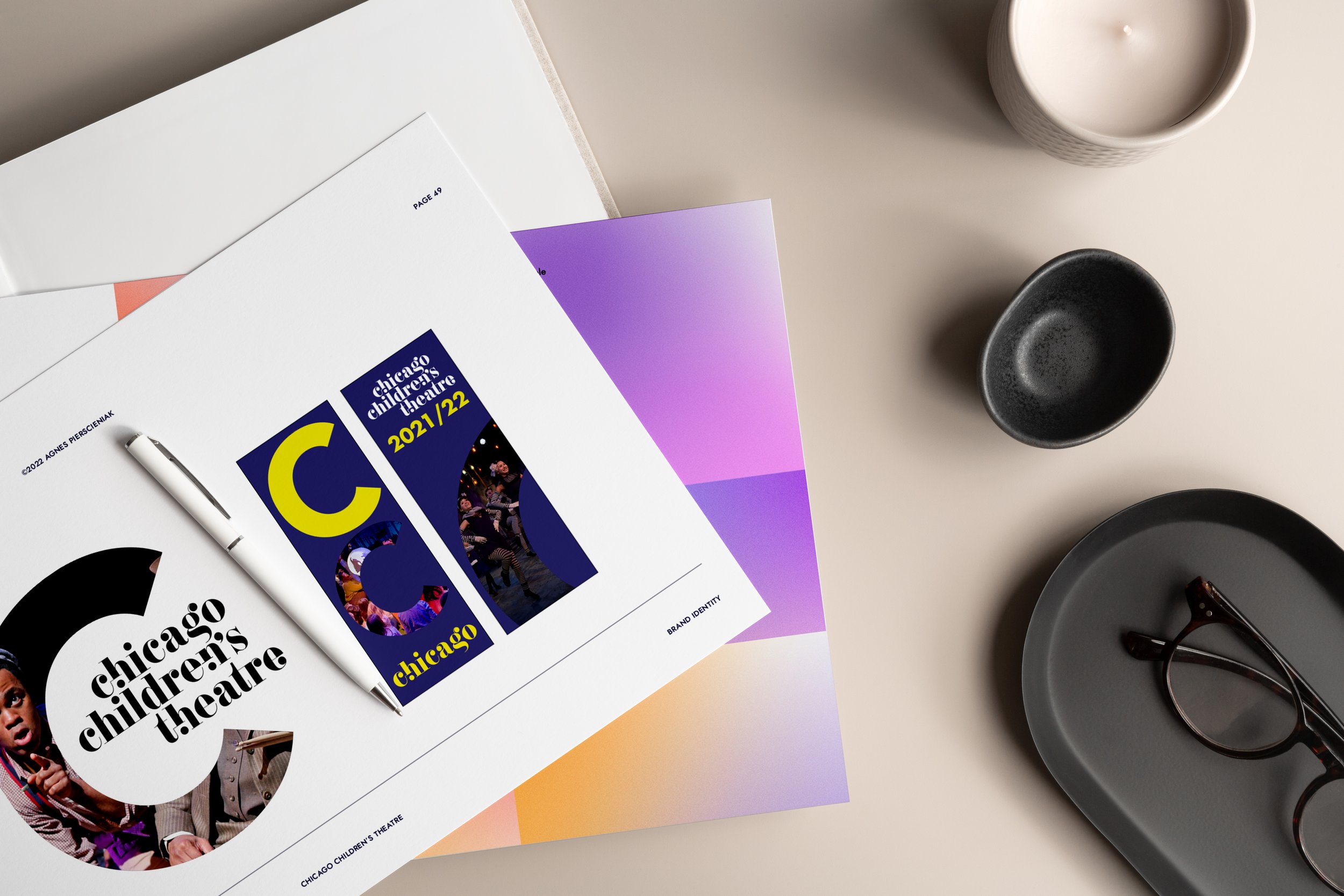
Graphics that Speak Volumes: The branding journey extends to the Annual Report and banners that adorn the theater's spaces, streets, and online platforms. These vibrant canvases, exuding confidence, capture the diverse range of emotions and stories awaiting young audiences inside the theater. The imagery reflects the imaginative world created within the theater, beckoning children and families to step into a realm where creativity knows no bounds.